Chaos theory and fractals: 4/4
4. I don’t understand how the butterfly effect looks like the structures seen in the book…a butterfly looking pattern.
The butterfly effect is just the name, slightly arbitrary, of the idea that complex systems exhibit the characteristic by which tiny tiny tiny (infintesimally tiny) changes in one part of the system have the potential (not always actualized) to transform THE ENTIRE system, on all its scales. The Lorenz attractor kind of has the shape of a butterfly, and can be an image that is used to explain this sensitive dependence on initial conditions, but don’t worry about linking the Lorenz attractor specifically to ‘regular space’.
Drawings like that are actually drawings in what is known as “phase space”, which is simply an N-dimensional space where each dimension is represented by a change in ONE variable. The point of such diagrams is that they can incorporate simultaneous changes in many different variables at the same time (although visually there are limits on how to do this, because we are always projecting back into 2D space; holograms would help, but would only add 1 more spatial dimension in which to visualize, whereas there can be an INFINITE number of dimensions to map, depending on the phenomenon and how complex we get in our analysis).
A dimension here is just the abstract space in which any single variable can be tracked, such as distance (up/down, left/right, forward/backward, yielding 3 dimensions that can be mapped in phase space), time (adding a 4th dimension in phase space), or anything else that we want to track, like ‘population number’ or ‘frequency/color’ or ‘subjective happiness rating’ or ‘distance from Antares’ or ‘fractal dimension’ or WHATEVER.
If you wanted to plot two of those variables you could do it on a simple cartesian XY graph; this is a 2D phase space. If you want to track three variable simultaneously, you need to add an extra axis, giving a 3D phase space. But you can graph things in unique ways, for example by varying the color according to some rule that links the color with a variable, say temperature (you’ve all seen graphs and maps like this). You can use more tricks to get more data in a phase space plot, but when it gets beyond 3 or 4 dimensions most scientists (and mathematicians especially) drop the visualization completely and just stick with the math — you get tables of numbers, each ‘row’ representing, for example, the state of the thing you are tracking, including all of its possible variables at that moment. The next row would show the state at the next moment, and so forth. Then you can just choose two or three of the possible N-dimensions and graph them against each other, and then take a new set, and so forth, until you see patterns.
FROM WIKIPEDIA: BUTTERFLY EFFECT
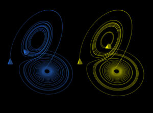
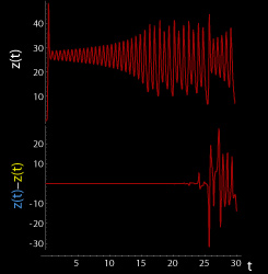
These figures show two segments of the three-dimensional evolution of two trajectories (one in blue, the other in yellow) for the same period of time in the Lorenz attractor starting at two initial points that differ only by 10−5 in the x-coordinate. Initially, the two trajectories seem coincident, as indicated by the small difference between the z coordinate of the blue and yellow trajectories, but for t > 23 the difference is as large as the value of the trajectory. The final position of the cones indicates that the two trajectories are no longer coincident at t=30.
Cool java applet showing the same principles: http://to-campos.planetaclix.pt/fractal/lorenz_eng.html


